Super Logos for a Super City
by Lyndon Hood

Rather than paying for a real logo, the Auckland Transition Agency has decided to run a public competition, complete with an open brief and a panel of unqualified judges. The idea is, this will be as awesome as the NZ Herald’s flag designs.
Debate is raging as to whether this is a surprisingly stupid plan or merely the kind of fundamental mistake you’d expect from a budding autocracy.
They have requested something “distinctive, exciting and dynamic”:

Click to enlarge
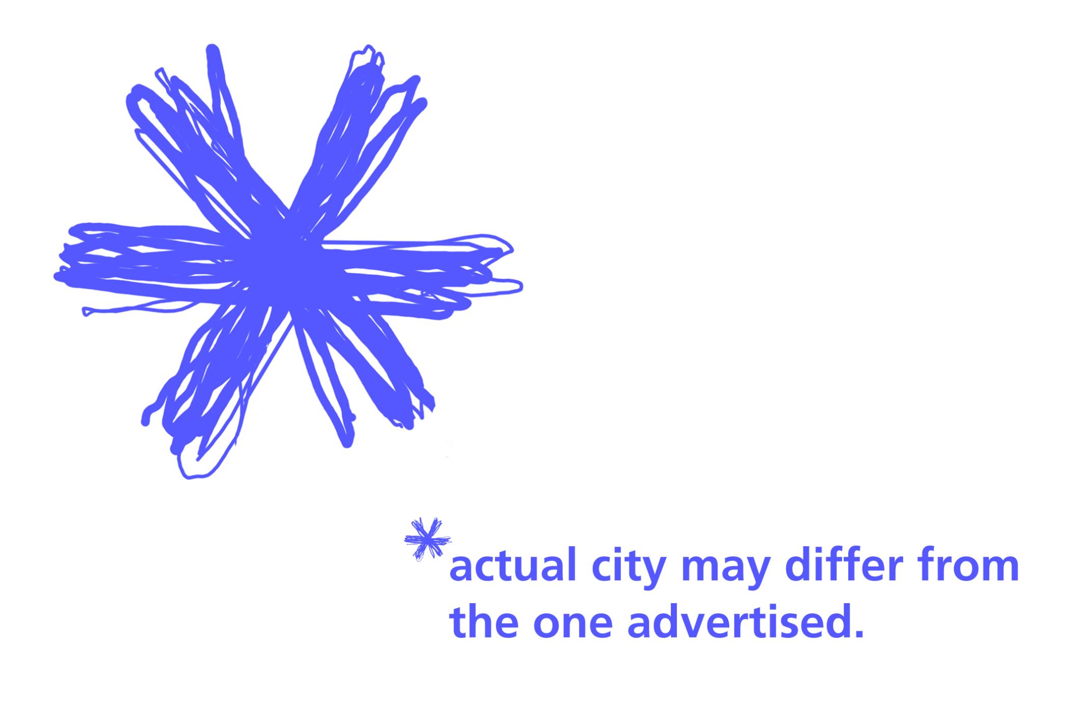
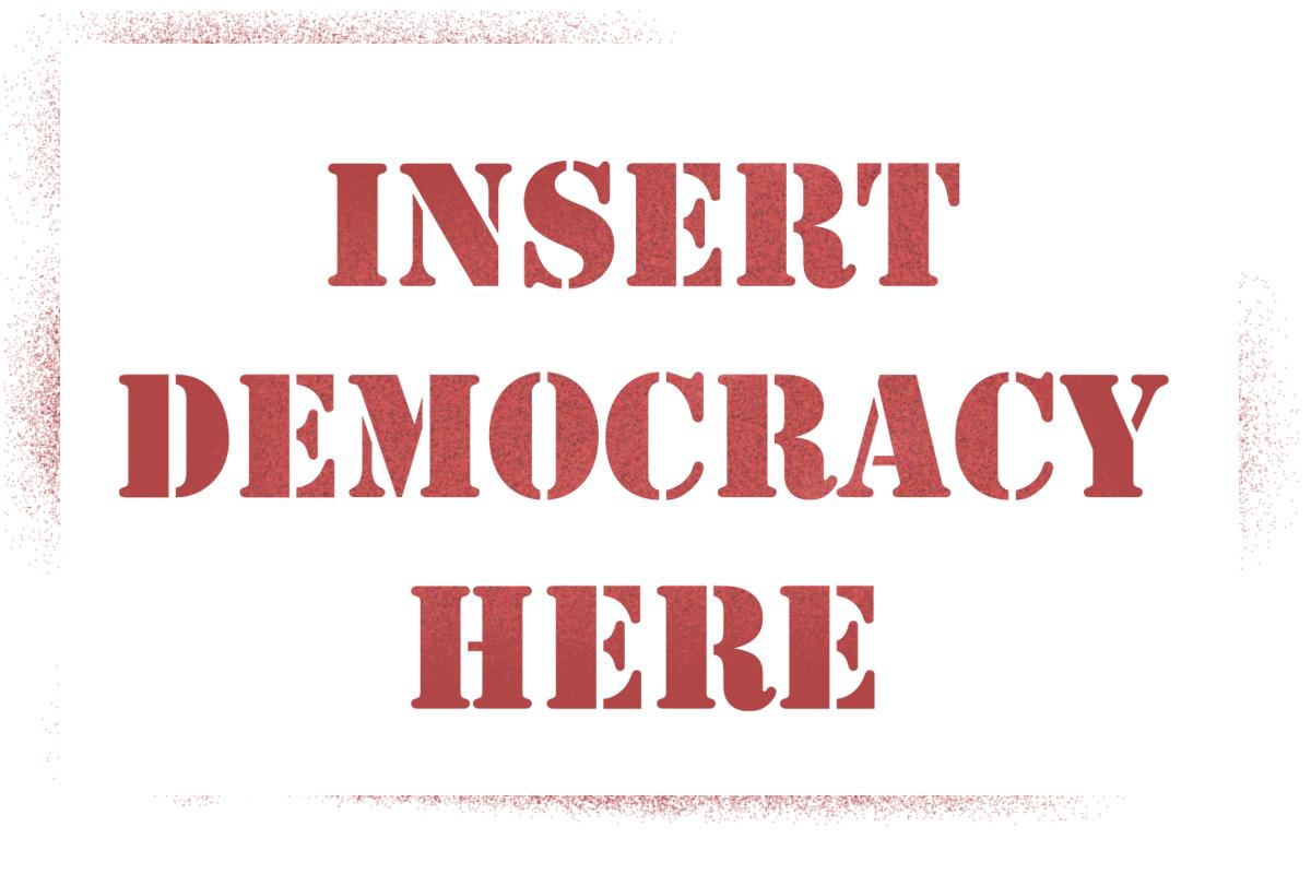
… although admittedly they also want it to reflect the nature of the newly-united city. This is trickier than it sounds, because you can’t really make a graphic of a giant clusterf#%k that’s appropriate for public consumption.
So I decided to concentrate on depicting the spirit in which the Auckland super city and its council were created.
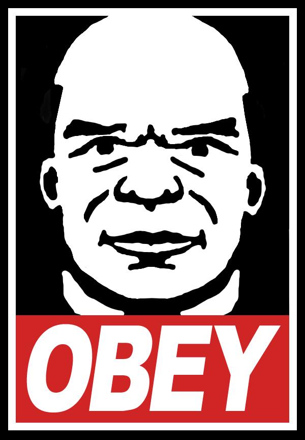
Click to enlarge

Click to enlarge

Click to enlarge
Unfortunately they say they’re not after a coat of arms or crest, because I was rather pleased with this:

Click to enlarge
The blazon shows the National Party’s legendary sense of righteous indignation – a creature famously ready to savage anyone who would undermine democracy, pouncing at the first sign of anyone allowing unelected government lackeys to control our lives, at the slightest abuse of process, or at any attempt to use political deals to rush through laws that ignore the objections of everyday New Zealanders.
It is depicted as confused and angry, because it hasn’t been let off its leash and it doesn’t understand why.

Click to enlarge

Click to enlarge
Click to enlarge
Click to enlarge
Click to enlarge
Some, who object to councils spending money on logos at all, have suggested the following:

Click to enlarge
However, it’s worth noting that under recent court rulings this could breach the copyrights both of the estate of composer John Cage and of author Stephenie Meyer.
The only other selection criteria that stuck in my mind was that the proposed logo had to be suitable for rubbish bags. I apologise to my competitors if this sews up the competition, but my final offering is this:
Click to enlarge
ENDS